The Filter: Website Development Selective Conversion
Why high-end firms need a contact flow that acts as a filter, ensuring you only speak to high-value prospects who value your expertise.
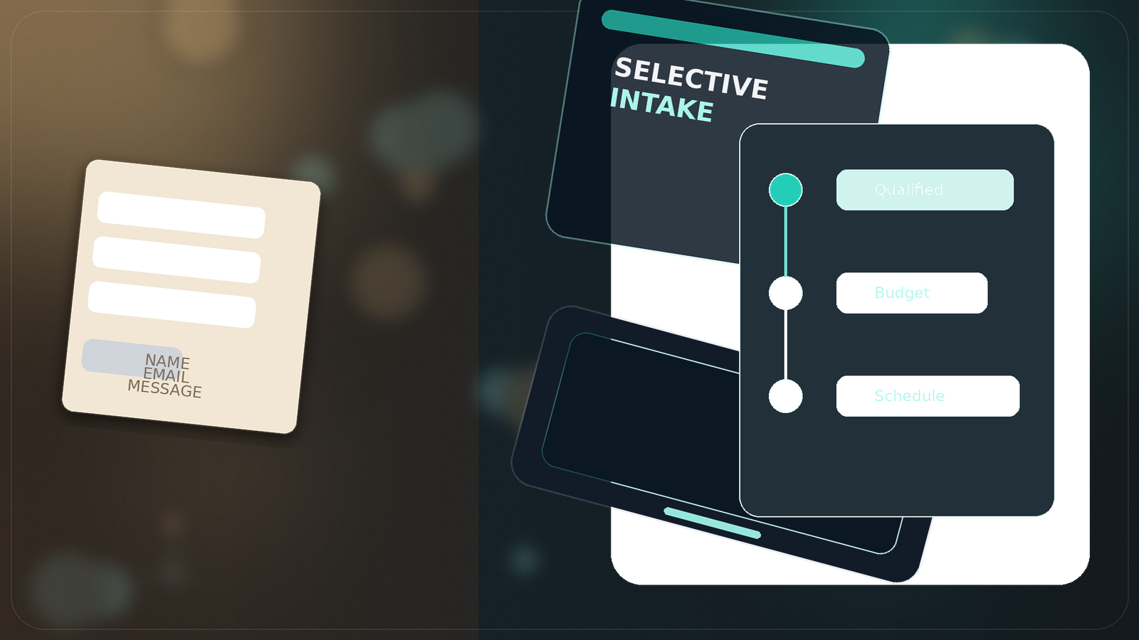
Most contact pages are designed to catch as many leads as possible. That's a mistake. If your business is about high-value expertise, your contact flow should be a filter. You don't want 'enquiries'; you want qualified opportunities. Stop chasing everyone and start selecting the best.
Selection over Solicitation
The tone of your contact page sets the tone for the entire relationship. If you look 'available' and 'eager', you've already weakened your positioning. A premium contact flow should feel exclusive and disciplined. It should ask for the right information to qualify the prospect before you ever pick up the phone.
This requires building a conversion path that respects your billable hours. By using a zero-bloat website redesign, we can ensure the process feels fast and professional. The goal is to make the right prospect feel lucky to work with you and the wrong prospect feel like they shouldn't bother.
Elite Filtering
Is your contact page a funnel or a filter?
Stop wasting time on low-value leads and start building for qualified intent.
Review The FilterLead Selection
Ready for a more selective inquiry path?
The best businesses don't chase leads; they build websites where the right leads find them.
Secure Your SlotRelated Insights
Keep Building The Topic Cluster
These pieces reinforce the same commercial themes and lead naturally into proof, services, and stronger enquiry paths.
Brand Positioning
Website Authority in Southeast Asia
Why businesses in Hong Kong and SE Asia still respond to British-led website standards, and how website quality wins international markets.
Read InsightPerformance
Website Systems: Why Static-First Wins
Why static-first builds on Vercel are the smartest commercial choice for high-performance service sites that value speed and search visibility.
Read InsightWebsite Strategy
Why Real Businesses Still Need Real Websites
Social media is brilliant at forming habits, but weak as a business foundation. Real websites still win because search intent, trust, ownership, and compounding content create durable profit.
Read Insight